
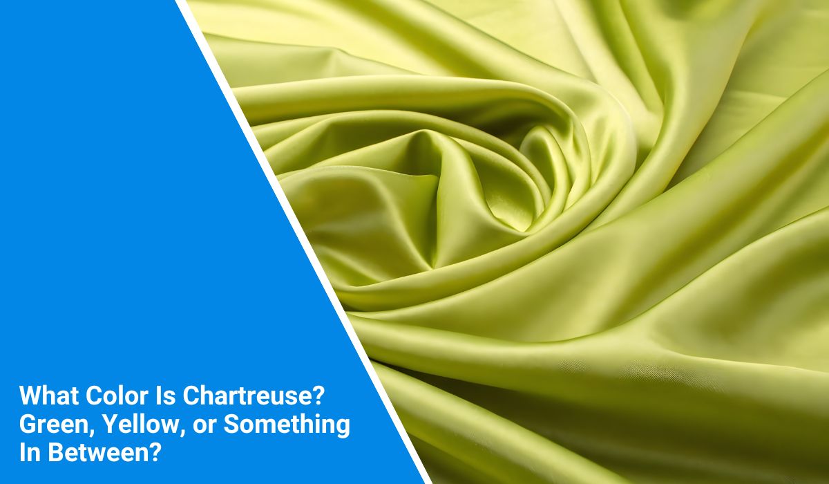
Chartreuse is one of those colors that always causes a pause. Some say it’s green. Others call it yellow. Designers use it in bold ways, but everyday people still wonder—what is it really?
The name sounds fancy, and if you’ve ever tried picking paint or a dress labelled “chartreuse,” you might’ve been confused. This article explains what chartreuse looks like, where it fits on the color wheel, and how you can spot or use it.
What Colour Is Chartreuse?
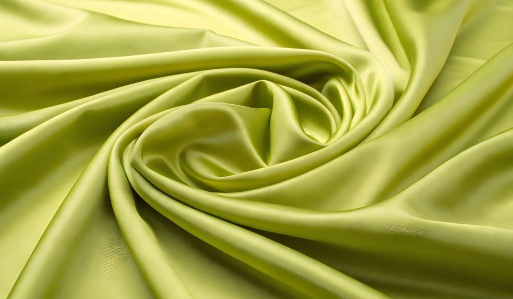 Chartreuse is a bright mix of yellow and green. It doesn’t lean all the way yellow, and it’s not fully green either. It sits right in the middle. That’s why people argue about it.
The word “chartreuse” comes from a French herbal liqueur that has a similar yellow-green tone. So the name didn’t start with art or science—it came from a drink. Over time, the word became known as a colour.
There are two types:
- Chartreuse green: more green with a yellow tint
- Chartreuse yellow: more yellow with a hint of green
Today, when people say chartreuse, they usually mean the bright yellow-green mix, halfway between the two.
Where It Sits on the Colour Spectrum?
Chartreuse lives between yellow and green on the colour wheel. It’s part of the secondary colour group, often called yellow-green. It’s not pastel and it’s not neon by default, but it stands out easily.
If you imagine the color wheel, chartreuse is that vivid segment where green starts to warm up toward yellow. It’s closer to lime than forest green, and it’s much warmer than teal.
It’s one of the most attention-grabbing shades in the visible color range—especially in nature and design.
Chartreuse vs Lime vs Neon Green
These colors confuse people because they’re all close, but they’re not the same. Here’s a quick breakdown:
| Color | Look | Difference |
|---|---|---|
| Chartreuse | Yellow-green, warm, fresh | The middle point between green/yellow |
| Lime | Green with a slight yellow tint | More green than chartreuse |
| Neon Green | Fluorescent, electric, glowing green | More intense and cooler in tone |
Chartreuse looks softer and more natural than neon. Lime leans a bit cooler and less yellow. They might look similar on a screen, but side-by-side, you’ll spot the difference.
The Big Debate: Is Chartreuse Green or Yellow?
Ask two people what chartreuse is, and you might get two answers.
Some say it’s a light green. Others say it’s a deep yellow. That’s because it’s technically both. The confusion started years ago when colour names were added to paint, fashion, and design catalogues. Different industries used the name in slightly different ways.
Designers might call it green. Fashion brands might call it yellow. The truth is: chartreuse sits exactly between them. It’s a blend—not one or the other. And that’s okay.
Chartreuse Colour Codes (Hex, RGB, CMYK)
In web and digital design, chartreuse has exact values. If you’re working on a screen, here’s what to use:
- Hex code:
#7FFF00 - RGB: (127, 255, 0)
- CMYK: (50%, 0%, 100%, 0%)
These numbers help artists, developers, and printers get the same colour every time. The brightness may still look different depending on screen type or light, but the code keeps it consistent.
Where You Might See Chartreuse in Real Life?
Once you know what it looks like, you’ll notice chartreuse everywhere.
You might spot it on:
- Neon highlighters
- Safety vests and traffic gear
- Tropical plants or snakes
- Bright sneakers or gym wear
- Trendy fashion pieces
- Interior walls or kitchen accents
It’s used when you want something bold. Something visible. It catches light and draws attention, which is why it’s popular in design and branding.
What Colours Go With Chartreuse?
Because it’s so bright, chartreuse works well with darker or cooler colours to balance it. If you’re styling an outfit or a room, try pairing it with:
- Black or charcoal grey
- Navy or denim blue
- Deep purple or eggplant
- Hot pink
- Crisp white
- Dark green or forest tones
These combinations help calm the brightness or make it pop even more, depending on the look you’re going for.
Final Thoughts
Chartreuse isn’t just green or yellow—it’s a perfect mix of both. It’s bold, it’s loud, and it’s unforgettable. That’s what makes it tricky, but also fun to use.
Now that you know what chartreuse looks like, you won’t be confused the next time you see it on a swatch, shirt, or website. Whether you call it green, yellow, or something in between—it’s chartreuse, and now you’ve got it right.
