
When well-designed, dashboards are essential tools for communicating data, guiding decision-making, and tracking key performance indicators (KPIs). However, not all information belongs on a dashboard, and not all visualizations improve understanding. Misusing dashboards can lead to confusion, misinterpretation, or decision paralysis—commonly due to what can be identified as dashboard anti-patterns. Knowing what not to chart is just as critical as knowing how to chart.
Understanding Dashboard Anti-Patterns
A dashboard anti-pattern is a recurring presentation or design mistake in dashboard development that negatively affects its clarity, usability, or purpose. These anti-patterns may seem like reasonable ideas at first but often result in an ineffective interface. Recognizing and avoiding them is vital for creating dashboards that actually serve the end users.
1. Charting Without a Clear Purpose
Perhaps the most common error in dashboard design is including charts that look impressive but provide little utility. Visualization without intent distracts rather than informs. Every chart should directly support a critical business question or objective.
- Bad example: Adding a pie chart showing regional sales distribution just because the data is available.
- Better approach: Display regional sales only if regional strategy or regional leadership needs to interpret and act upon the data.
Before including a chart, ask: “What decision will this help make?” If no practical decision is supported by the visualization, it should be removed or replaced.
2. Replicating Data Tables as Visual Charts
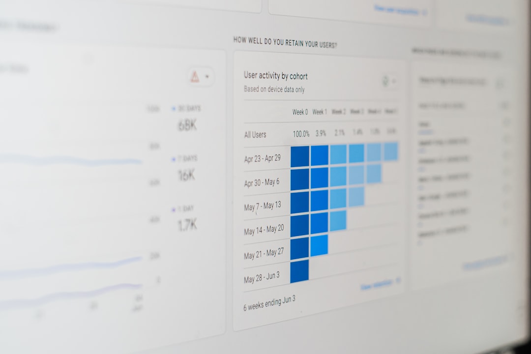
Dashboards are not spreadsheets. Yet, a common anti-pattern is visualizing complex data tabulations as charts when they were clearer as structured tables. For example, converting a detailed monthly sales report into a stacked bar chart may oversimplify and lead to misinterpretation.
Charts should summarize trends, not duplicate exhaustive row-level data. If the dataset is granular and meant for drill-downs or precise comparisons, offering the option to export or view the raw table is often more effective.
3. Overuse of Pie Charts
Though visually appealing, pie charts are often misused. They are ineffective for displaying many data points or making accurate comparisons between slightly different values.
Use pie charts only when:
- There are fewer than five categories.
- Each category represents a mutually exclusive portion of a whole.
- Category differences are large and visually distinct.
For instance, a bar chart is usually superior for displaying sales by product category, especially when there are moderate to large differences in values.
4. Tracking Metrics That Cannot Be Owned
Some dashboards are filled with metrics that sound impressive but have no clear owner or actionable influence. For example, displaying “global economic confidence” on a regional marketing dashboard may lead to curiosity but not to informed business decisions.
Every metric on a dashboard should have:
- A responsible owner who monitors it.
- A clear benchmark or goal.
- Potential decisions or actions that can be taken based on it.
Otherwise, the metric becomes a noise—interesting perhaps, but not useful.
5. Excessive Real-Time Data
Modern business intelligence tools can update in near-real-time. While this sounds advantageous, displaying constantly shifting real-time data on executive dashboards can lead to unnecessary anxiety or reactionary decision-making.
Consider whether your users genuinely need real-time feeds or if hourly, daily, or even weekly updates suffice. Real-time dashboards are best reserved for operations centers or contexts where immediate reactions are critical—like logistics or system monitoring.

6. Cluttering Dashboards with Vanity Metrics
Vanity metrics might look good on a dashboard but provide little genuine insight. These could include total website visits, social media follower counts, or app downloads—figures that can easily be inflated or misinterpreted.
Effective dashboards prioritize actionable metrics over vanity numbers. For example:
- Vanity metric: Number of app downloads.
- Actionable metric: Number of active users who completed an in-app purchase daily.
Ask: Would seeing this number increase directly lead me to take a specific action? If the answer is no, it may be better to leave it out.
7. Mixing Incompatible Time Frames and Measures
Another subtle yet harmful anti-pattern is combining data from different timeframes or interpretations on the same dashboard panel, leading to misleading visuals. For instance, showing monthly revenue next to weekly churn makes it difficult to reasonably compare trends or understand context.
Maintaining consistency in:
- Time granularity: daily, weekly, monthly—choose one per panel.
- Units of measurement: do not mix revenue, users, and click rates arbitrarily.
Inconsistent measurements confuse users, drawing attention to anomalies where none exist.
8. Using Complicated Visualization Types Unnecessarily
Exotic visualizations like radial charts, word clouds, or Sankey diagrams can sometimes be useful—for niche situations and expert audiences. However, in most dashboards, these types of charts become barriers rather than bridges to comprehension.
Stick to simple, easily interpretable chart types:
- Line charts for trends over time.
- Bar charts for comparisons among categories.
- Tables for exact values or when high precision is required.
When in doubt, clarity should always trump creativity in dashboard design.
Evaluating When Not to Chart
So how can we determine when it’s appropriate to include a chart—and when it’s better left out? Try the following decision framework:
- Is there a clear business question this chart answers?
- Will this visualization change someone’s behavior or decision?
- Can the data be expressed more clearly in text or a simple table?
If the answer to all three is “no,” then it’s wise to reconsider including that chart.
The Role of Storytelling and Focus
A dashboard is not an archive. The goal is narrative focus, not comprehensive coverage. The best dashboards tell a clear and compelling story, just like a news article or presentation. They highlight exceptions, trends, and decisions that matter.
Avoid the temptation to please every stakeholder by adding more and more charts. More data does not equal more insight—it often equals distraction. Curate with a purpose.

Conclusion
Effective dashboards are streamlined, outcome-oriented instruments. They don’t chart every available data point but instead illuminate meaningful ones. By recognizing and avoiding dashboard anti-patterns like charting for the sake of it, favoring complexity over clarity, or saturating with vanity metrics, organizations can reclaim the power of their data.
In the end, great dashboards aren’t a collection of colorful charts—they’re focused tools built to support smart decisions. Knowing when not to chart is a hallmark of dashboard maturity and analytic wisdom.
