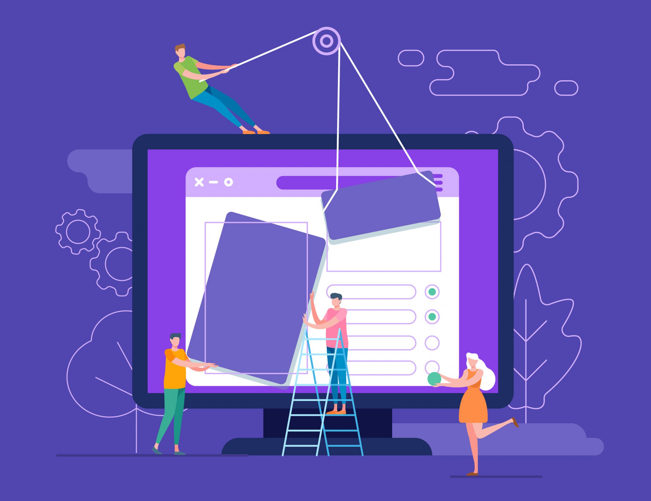
Web design is a highly creative process. It involves the incorporation of various elements in order to be functional and aesthetically pleasing. Considering the level of creativity involved, there are so many different directions and styles that your website can go. It can range from minimalistic to classy, depending on your preferences. But what are the do’s and don’ts of effective web design amidst creativity? Read on to find out!
 3 Do’s
- Get the Right Web Hosting
Web hosting refers to the space you buy or rent on a web server where your files will be stored. While you can completely design a website and include all the elements, it will not be available online until it is on the server. Most website owners choose to pay for this space monthly or annually, depending on the available budgets. Choosing the right web hosting company such as IONOS ensures that your website is fast and scalable based on your needs. The system also brings you SSL encryption and DDoS protection with 99.9% uptime, which is arguably the best in the market. It means that your site visitors will not have to deal with avoidable errors such as 404s.
- Keep Your Audience in Mind
Most people set up websites with the aim of selling a product or a service. Even though you own the website, your focus should be on keeping the visitors engaged and satisfied. Consider enhancing the website’s navigation, as it is the cornerstone of usability. If clients can quickly find information on your website, they are more likely to make a return visit.
- Optimise Your Website’s Images
At a time when infographics and visuals are huge in website design, you need to optimise the website images to create an immersive experience. These photos should interactively tell your brand’s stories without causing lags to your visitors. Your best shot is to resize the pictures without altering their quality.
3 Don’ts
- Don’t Make Your Users Wait
After a hard-to-read domain name, the next thing that site visitors hate is having to wait. Research shows that more than 80% of visitors are willing to wait for 3 seconds for a page to load. If it doesn’t load within that time, they may abandon carts on your site, and this implies a loss for you.
- Don’t Clutter the Website
Your homepage is the most important part of the website. Having it full of clutter confuses the visitors and may cause them to miss important information. Since most people quickly scan a page and pick out keywords, you need not clutter it. The less they have to read, the better for you.
- Don’t Autoplay Videos
Autoplaying videos are a great way to advertise and make the website more accessible. If a person cannot read through, they can watch the videos and know exactly what you sell or are involved in. However, videos that automatically play once a visitor lands on your website are irritating and will cause you to lose traffic.
 Conclusion
All the above are basics that you must understand when designing a website. The best practices involve choosing a good web hosting company, while the worst you can do is cluttering it and adding autoplay videos. Simply understand your audience and craft your website to fit their needs.


