Any website, for a variety of different reasons, is at risk of failure if its navigation is inaccessible. If customers scroll down your website and cannot easily find their way back to the information they were seeking, they will most likely click away from your site and look for the solution elsewhere. This is one of the most apparent reasons why customers leave a website.
This is detrimental to your overall traffic, your search engine optimization, and, most importantly, your user experience. Customers typically do not return when the navigation is difficult to understand or use, customers typically do not return. Therefore, despite the fact that you might not have given it much thought, you should realize that it is significant.
In this post, we’ll take a look at a plugin that promises to solve these problems and do so in a timely manner by enabling you to add as many sticky elements as you desire without any restrictions.
WP Sticky
Since its original release, the WP Sticky premium plugin for WordPress has garnered significant interest from users. In a nutshell, the developer of this plugin asserts that it is blazingly quick, that it plays well with other plugins, and that it offers a wide range of capabilities that are intuitive to operate for users of all experience levels. The visual picker is one of its most significant features since it allows users to remove any code from the equation altogether. This is an excellent addition for users who do not know about web design.
Most Outstanding Features:
- WP Sticky is lightning quick and won’t slow down your site in any way, unlike many other plugins.
- WP Sticky’s visual picker eliminates the need for any coding.
- There is no limit to the number of sticky elements you can have. When utilizing this tool, you can make as many or as few objects sticky.
- Cross-compatible – WP Sticky will not conflict with any other plugins you have installed on your site. There is no limit to the number of extensions you can add. It’s all going to work out perfectly when put together.
- The developers themselves provide support for this plugin, so you know you’re getting the best. Neither now nor in the future will there be any use of outsourced support.
- Even though it has a lot of customization options, WP Sticky is exceptionally user-friendly because of its user-centered design.
How It Operates
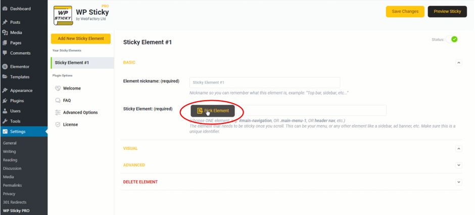
Even though the user interface is straightforward, it nevertheless manages to pack a significant punch in terms of functionality. You only need to navigate to “Settings,” choose the plugin, and then create a new sticky element. Prior to beginning the process, you will be prompted to give the element a name, but after that, you are good to go.
 After giving the element a name, the aforementioned visual picker will become available to you. People with no prior experience with web design can benefit greatly from this feature because it speeds up the process and makes it easier for them to follow. This is something that needs to be pointed out.
The visual picker can be activated by clicking the “Pick Element” button on the toolbar. Following that, the plugin will load your site and add a Wp Sticky menu to the very top of the page. As you move the cursor about, little yellow lines will appear around each individual piece; using these lines as a guide, select the piece that has the most lines that match the one you want. Click on the part you’ve identified as the one you want to make sticky, and the plugin will immediately provide a one-of-a-kind identifier for you to use.
If, on the other hand, you are already familiar with the nature of the component that you wish to change, there is no requirement that you use the visual picker. You only need to write it down, and the task will be finished for you.
You will find the option to modify your new sticky element within the Basic Options menu. Even though they are the most fundamental possibilities, a great deal may still be accomplished with them.
The ability to select which devices your sticky element will be displayed on is a beneficial feature in the basic settings. Just switch it on or off for the specific devices you desire, and you’ll be able to perform anything you need with a single click of a button. Make your sticky element more visually engaging by applying various effects, such as making it fade in or gliding down. Would you like to have a larger sticky menu on a desktop, but not on your phone? Decide between the two and see which you prefer.
As a bonus, you can change the opacity of your sticky element’s transparency with a slider or add a backdrop color to make it stand out even more. You don’t have to do anything if you don’t want to, but you do have the option if you do want to participate.
Additionally, there are a few more customization possibilities, including as:
- An object’s vertical stacking can be controlled by setting the Z-index.
- In order for an element to become sticky, the user must have browsed at least 20% of the page’s length.
- Advanced Customization – A host of additional options for personalizing the app.
Pricing Plans
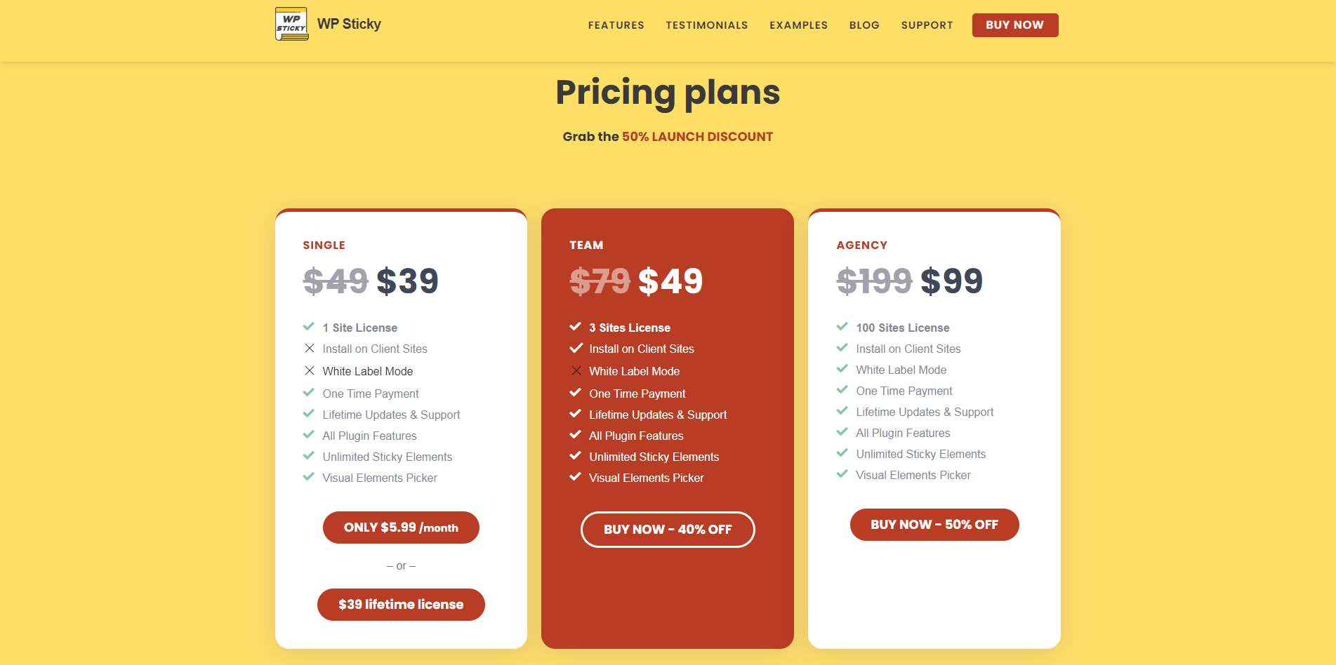
You have the option to choose from one of three different price options. If you operate a website, you will probably require the Single or Team plan; the former costs just $39 per month, while the latter is currently available for just $49 per month.
You will need to upgrade to the $99 Agency plan if you have more than three sites and/or wish to use the plugin’s white-label mode to interact with clients. This upgrade is required in order to use the white-label mode.
 Conclusion
Any website is at risk for failure if its navigation is difficult to understand or use. This is one of the most apparent reasons why customers leave a website. In this post, we’ll take a look at a plugin that promises to solve these problems and do so promptly.


