
Turning plain text into a stunning logo sounds fancy. It is not. In fact, it can be fun and surprisingly easy. With modern text logo makers, you can transform simple words into eye-catching brand visuals in minutes. No design degree needed. No expensive software required. Just your idea and a little creativity.
TLDR: You can turn simple text into a beautiful logo using online text logo makers. These tools offer fonts, colors, effects, and templates to make your words stand out. Start with a clear brand idea, choose the right style, and customize step by step. In minutes, your plain text can look bold, modern, playful, or professional.
Why Text Logos Work So Well
Some of the world’s biggest brands use simple text logos. Think about it. Clean letters. Strong fonts. Memorable style. That is it.
Text logos work because:
- They are easy to recognize.
- They are simple and clean.
- They scale well on websites and products.
- They look professional when done right.
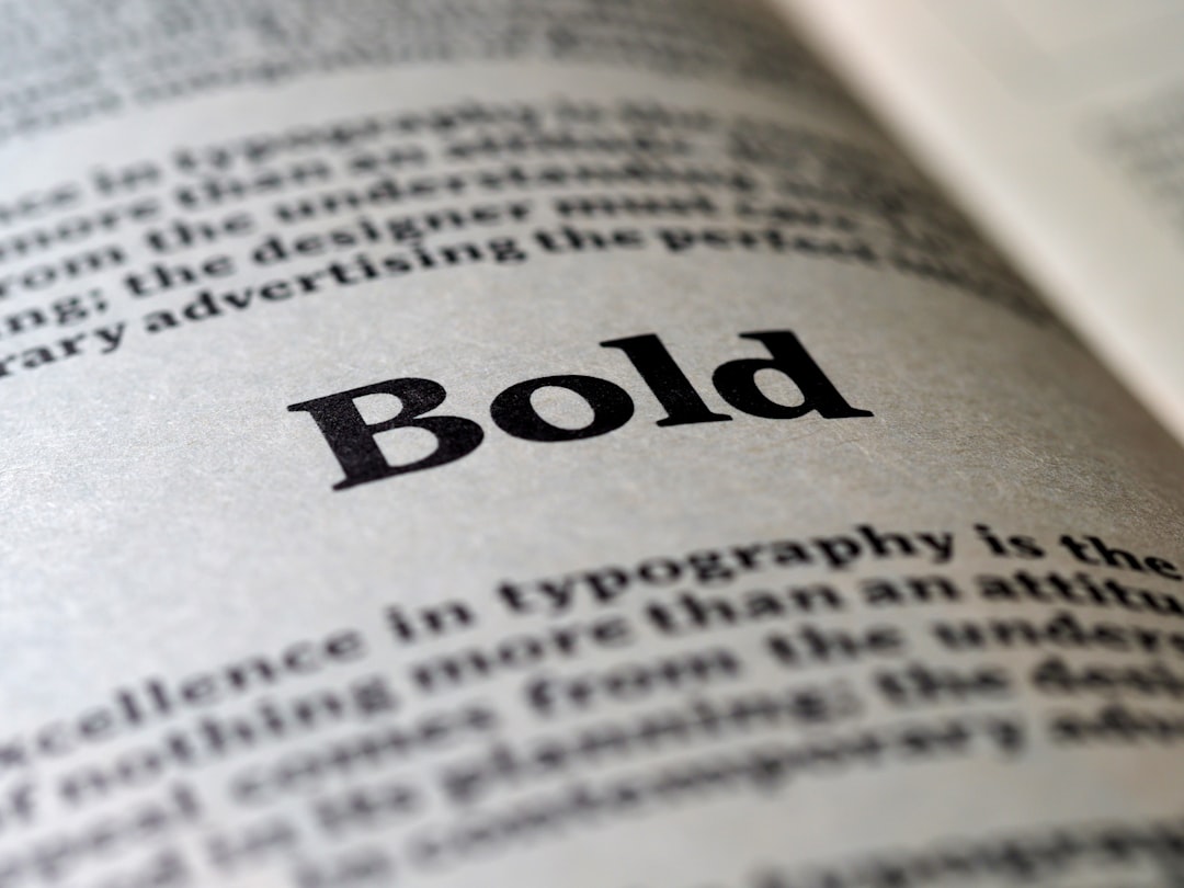
A strong font choice can say a lot. Bold letters feel powerful. Thin letters feel elegant. Script fonts feel personal. The magic is in the details.
What Is a Text Logo Maker?
A text logo maker is an online tool that turns your typed words into styled logos. You enter your brand name. Then you customize.
You can usually:
- Choose fonts
- Change colors
- Add effects like shadow or glow
- Adjust spacing
- Add simple icons
- Download high-quality files
Most tools are drag and drop. Very beginner friendly. Some are even free.
Step 1: Start With Clear Text
Before opening any tool, pause. Think.
What is your brand name? Is it short? Long? Can it be shortened?
Simple is powerful.
If your name is:
- Very long, consider initials.
- Hard to read, simplify spelling.
- Generic, add a unique twist.
Your text is the foundation. A messy name makes a messy logo.
Step 2: Pick the Right Font Style
Fonts are not just letters. They have personality.
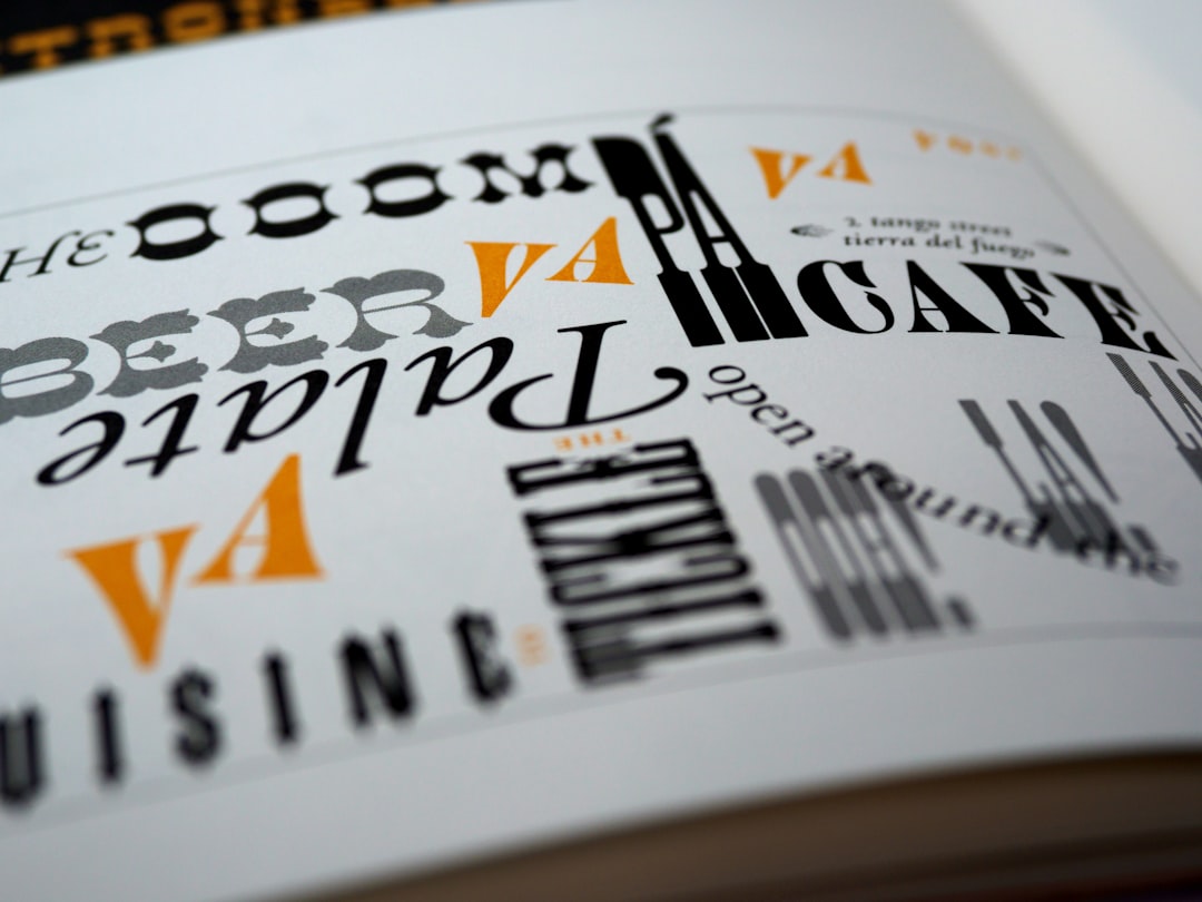
Here are common font types:
- Serif – Classic. Traditional. Trustworthy.
- Sans Serif – Modern. Clean. Minimal.
- Script – Elegant. Creative. Personal.
- Display – Bold. Unique. Attention grabbing.
If you run a law firm, a playful script font may not work. If you sell handmade candles, a rigid corporate font might feel cold.
Match the font to your brand mood.
Step 3: Choose Colors That Speak
Color changes everything.
Blue feels safe. Red feels energetic. Green feels fresh. Black feels premium.
Try this simple rule:
- Use one main color.
- Add one accent color.
- Keep backgrounds clean.
Too many colors can look messy. Less is more.
Step 4: Add Effects (But Do Not Overdo It)
Text logo makers offer effects like:
- Shadow
- Outline
- Gradient
- Glow
- 3D depth
These can make your logo stand out. But be careful.
If everything screams, nothing stands out.
Add one or two subtle effects. Check how it looks in small size. If it still looks clear, you are on the right track.
Step 5: Adjust Spacing and Alignment
This step is often ignored. But it matters a lot.
Letter spacing can make your logo feel:
- Luxury (wide spacing)
- Compact and strong (tight spacing)
- Balanced (moderate spacing)
Also check alignment:
- Centered for formal brands
- Left aligned for modern styles
- Stacked words for compact design
Small tweaks can create big impact.
Popular Text Logo Makers Compared
There are many tools available. Some are simple. Some offer advanced customization.
| Tool | Best For | Ease of Use | Free Option | Download Quality |
|---|---|---|---|---|
| Canva | Beginners and social media brands | Very easy | Yes | High resolution with paid plan |
| Looka | AI generated logo ideas | Easy | No full free download | Professional branding kit |
| Hatchful | Small business owners | Very easy | Yes | Good for web use |
| DesignEvo | Custom text based logos | Easy | Limited free | High resolution with upgrade |
If you want fast and simple, Canva is great. If you want AI suggestions, try Looka. If you want quick and free, Hatchful may work well.
How to Make Your Logo Look Professional
Want your logo to look like a designer made it? Follow these tips:
- Use no more than two fonts.
- Keep colors limited.
- Test on light and dark backgrounds.
- Check how it looks in small size.
- Avoid trendy effects that may age quickly.
Also, zoom out. If your logo is readable from far away, that is good design.
Create Variations
Smart brands create different versions:
- Main horizontal logo
- Stacked version
- Icon only version
- Black and white version
This helps your brand stay flexible. You will need different sizes for websites, social media, packaging, and email signatures.
Image not found in postmetaCommon Mistakes to Avoid
Even with great tools, mistakes happen.
Watch out for:
- Using too many effects
- Choosing hard to read fonts
- Following trends blindly
- Ignoring spacing
- Not checking mobile view
Your logo should be timeless. Clean wins almost every time.
Export the Right File Type
Once your logo is ready, download it properly.
- PNG – Great for websites. Supports transparent background.
- JPG – Good for general use. Smaller size.
- SVG – Best for scaling. Perfect for printing and large banners.
If possible, get an SVG file. It keeps quality no matter the size.
Test It in Real Life
Do not stop after download.
Place your logo:
- On your website header
- On a mock social media profile
- On business cards
- On product packaging
Does it still look strong? Is it readable? Does it feel right?
If yes, great. If not, go back and tweak.
Confidence Is Key
At the end of the day, your logo represents your idea. Your effort. Your brand story.
A text logo does not need flashy graphics to shine. When done well, it looks confident. Clear. Professional.
The best part? You created it.
Final Thoughts
Turning simple text into a stunning logo is easier than ever. With modern text logo makers, you can experiment, adjust, and improve in real time. The tools do the heavy lifting. You bring the creativity.
Keep it simple. Choose the right font. Use smart colors. Add subtle effects. Test everywhere.
That is it.
Your words deserve to be seen. Now you know how to make them stand out.
